Sep 272013
 

I’ve been hesitant to write about this, as skeptics will already have plenty to gripe about, I don’t need to pile on. And I swear I am not looking for excuses to bash the IPCC, not to mention that I have little sympathy or patience for skeptics who believe that an entire body of science is just one huge scam to make Al Gore and his buddies rich.

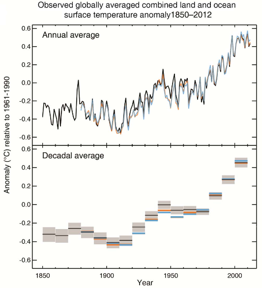
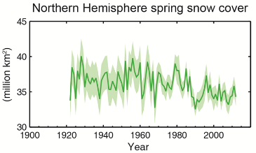
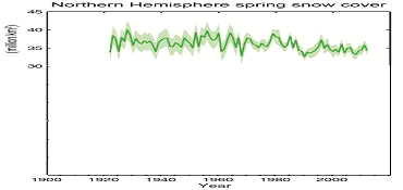
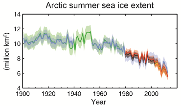
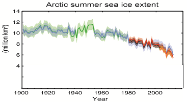
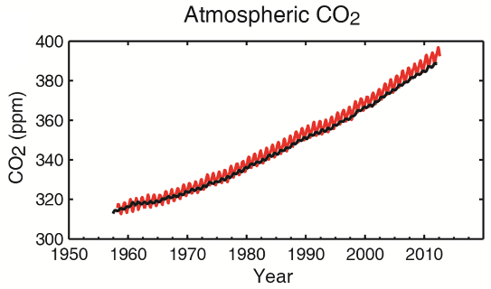
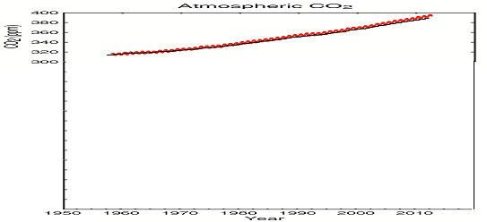
But… I was very disappointed to see plots in the latest IPCC “Summary for Policymakers” report that appear unnecessarily manipulative.

Wikipedia describes these as truncated or “gee-whiz” graphs: graphs in which the vertical axis does not start at zero. This can dramatically change the appearance of a plot, making small variations appear much larger than they really are.

To be clear, the use of truncated plots is often legitimate. Perhaps the plot compares two quantities that are of a similar magnitude. Perhaps the plot shows a quantity the absolute magnitude of which is irrelevant. Perhaps the quantity is such that “0” has no special meaning or it is not a natural start of the range (e.g., pH, temperature in Centigrade).

But in other cases, this practice can be viewed as misleading, intellectually dishonest (for instance, it is common for financial companies to manipulate plots this way to make their market performance appear more impressive than it really is) or outright fraudulent.

So here we are, the 2013 IPCC report’s summary for policymakers has been released in draft form, and what do I see in it? Several key plots that have been presented in truncated “gee-whiz” form, despite the fact that the quantities they represent are such that their absolute magnitudes are relevant, that their variability must be measured against their absolute magnitudes, and where zero is a natural start of the range.

I am presenting the original plots on the left and my crudely “untruncated” versions on the right:

This is not kosher, especially in a document that is intended for consumption by a lay audience who may not have the scientific education to spot such subtleties.

The document is still labeled a draft, with copy editing in particular yet to take place. Here’s to hoping that these plots (and any similar plots that may appear in the main report) are corrected before publication, to avoid the impression of trying to exaggerate the case for climate change. Scientists should be presenting the science objectively and leave the manipulation, even inadvertent manipulation, to politicians.

 Posted by at 10:22 pm
Sep 062013
 

Last December, I wrote a blog entry in which I criticized one aspect of the LHC’s analysis of the scalar particle discovered earlier this year, which is believed to be the long sought-after Higgs boson.

The Higgs boson is a scalar. It is conceivable that the particle observed at the LHC is not the Higgs particle but an “impostor”, some composite of known (and perhaps unknown) particles that behaves like a scalar. Or, I should say, almost like a scalar, as the ground state of such composites would likely behave like a pseudoscalar. The difference is that whereas a scalar-valued field remains unchanged under a reflection, a pseudoscalar field changes sign.

This has specific consequences when the particle decays, apparent in the angles of the decay products’ trajectories.

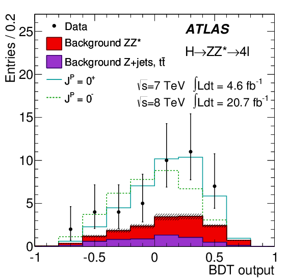
Several such angles are measured, but the analysis used at the ATLAS detector of the LHC employs a method borrowed from machine learning research, called a Boosted Decision Tree algorithm, that synthesizes a single parameter that has maximum sensitivity to the parity of the observed particle. (The CMS detector’s analysis uses a similar approach.)

The result can be plotted against scalar vs. pseudoscalar model predictions. This plot, shown below, does not appear very convincing. The data points (which represent binned numbers of events) are all over the place with large errors. Out of a total of only 43 events (give or take), more than 25% are the expected background, only 30+ events represent an actual signal. And the scalar vs. pseudoscalar predictions are very similar.

This is why, when I saw that the analysis concluded that the scalar hypothesis is supported with a probability of over 97%, I felt rather skeptical. And I thought I knew the reason: I thought that the experimental error, i.e., the error bars in the plot above, was not properly accounted for in the analysis.

Indeed, if I calculate the normalized chi-square per degree of freedom, I get \(\chi^2_{J^P=0^+} = 0.247\) and \(\chi^2_{J^P=0^-} = 0.426\), respectively, for the two hypotheses. The difference is not very big.

Alas, my skepticism was misplaced. The folks at the LHC didn’t bother with chi-squares, instead they performed a likelihood analysis. The question they were asking was this: given the set of observations available, what are the likelihoods of the scalar and the pseudoscalar scenarios?

At the LHC, they used likelihood functions and distributions derived from the actual theory. However, I can do a poor man’s version myself by simply using the Gaussian normal distribution (or a nonsymmetric version of the same). Given a data point \(D_i\), a model value \(M_I\), and a standard deviation (error) \(\sigma_i\), the probability that the data point is at least as far from \(M_i\) as \(D_i\) is given by

\begin{align}
{\cal P}_i=2\left[1-\Psi\left(\frac{|D_i-M_i|}{\sigma_i}\right)\right],
\end{align}

where \(\Psi(x)\) is the cumulative normal distribution.

Now \({\cal P}_i\) also happens to be the likelihood of the model value \(M_i\) given the data point \(D_i\) and standard distribution \(\sigma_i\). If we assume that the data points and their errors are statistically indepdendent, the likelihood that all the data points happen to fall where they fell is given by

\begin{align}
{\cal L}=\prod\limits_{i=1}^N{\cal P}_i.
\end{align}

Taking the data from the ATLAS figure above, the value \(q\) of the commonly used log-likelihood ratio is

\begin{align}
q=\ln\frac{{\cal L}(J^P=0^+)}{{\cal L}(J^P=0^-)}=2.89.
\end{align}

(The LHC folks calculated 2.2, which is “close enough” for me given that I am using a naive Gaussian distribution.)

Furthermore, if I choose to believe that the only two viable hypothesis for the spin-parity of the observed particle are the scalar and pseudoscalar scenarios (e.g., if other experiments already convinced me that alternatives, such as intepreting the result as a spin-2 particle, can be completely excluded) I can normalize these two likelihoods and interpret them as probabilities. The probability of the scalar scenario is then \(e^{2.89}\simeq 18\) times larger than the probability of the pseudoscalar scenario. So if these probabilities add up to 100%, that means that the scalar scenario is favored with a probability of nearly 95%. Not exactly “slam dunk” but pretty darn convincing.

As to the validity of the method, there is, in fact, a theorem called the Neyman-Pearson lemma that states that the likelihood-ratio test is the most powerful test for this type of comparison of hypotheses.

But what about my earlier objection that the observational error was not properly accounted for? Well… it appears that it was, after all. In my “poor man’s” version of the analysis, the observational error was used to select the appropriate form of the normal distribution, through \(\sigma_i\). In the LHC’s analysis, I believe, the observational error found its was into the Monte-Carlo simulation that was used to develop a physically more accurate probability distribution function that was used for the same purpose.

Even clever people make mistakes. Even large groups of very clever people sometimes succumb to groupthink. But when you bet against clever people, you are likely to lose. I thought I spotted an error in the analysis performed at the LHC, but all I really found were gaps in my own understanding. Oh well… live and learn.

 Posted by at 4:12 pm
Jul 202013
 

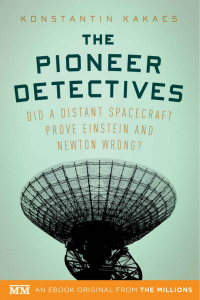
I spent a part of yesterday afternoon speed-reading Konstantin Kakaes’s new e-book, The Pioneer Detectives. It’s a short book (still well worth the $2.99 Kindle price) but it reads very well and presents a fair picture of our efforts researching the origin of the anomalous acceleration of the Pioneer 10 and 11 spacecraft.

Yes, I was one of those “detectives”. (In fact, I still consider myself one, as I don’t believe our job is quite done yet; we still owe the community a detailed account of our research and an update of our Pioneer Anomaly review before we can move on with a clean conscience.) So I have an insider’s view of this very intriguing story.

I had a chance to talk with Kakaes at length when he visited me here in Ottawa last year. Over the years, I learned to be apprehensive when talking to journalists; often, the words they put in your mouth bear little resemblance to what you actually said to them when interviewed. I was relieved that this was not the case now: at no time did I feel compelled to cringe while reading the book.

So I really enjoyed Kakaes’s telling of our story. Indeed, I think I learned a thing or two about presenting a complex subject to a non-specialist audience. Kakaes, an accomplished science journalist, manages to do so without dumbing it down with excessive oversimplifications.

One person whose views may not be as favorable is the original discoverer of the Pioneer anomaly, John Anderson. I am told that Anderson is not fond of our results. Kakaes believes that this is because Anderson is “blinded by his desire to believe in something new, in something unexplained. He wants so badly not to know.” Yes, scientists are people, too, and the prospect that a discovery you made, once thought profound, may just be an engineering fluke is not an easy one to swallow. Kakaes does what a responsible journalist must do: he tries to paint an objective picture, which sometimes includes unflattering bits. Yet I think that John Anderson has more scientific integrity than Kakaes gives him credit for.

And to be perfectly honest, I am also disappointed with our own results. When I first read about the Pioneer anomaly (as an outsider, long before my involvement) it seemed to fit perfectly into the big scheme: namely that perhaps the same physics that was responsible for significant deviations from Einstein’s and Newton’s predictions on cosmological and galactic scales might also be responsible for a small but measurable deviation here in the solar system. This was a fantastic prospect!

Sadly, it was not to be. What once seemed like a revolutionary, paradigm-shifting result has been reduced to a small footnote in the history of gravitational physics. Yet I think that our story is nonetheless intriguing. Kakaes seems to think so, too, judging by his book. A book that I am happy to recommend.

 Posted by at 6:55 pm
May 242013
 

Physics blog sites are abuzz about Eric Weinstein and his Amazing New Theory of Everything. For a moment, I actually confused him with Eric Weisstein, well known in physics and math circles as the founder of Mathworld, which, in the pre-Wikipedia days, was the Internet’s pre-eminent mathematics encyclopedia (only to be hijacked for a while by an unscrupulous CRC press). No, Weinstein is someone else: he is a mathematical physicist turned economist. In any case, he is no dummy, nor does he appear to be a crackpot. He is outside of academia, but, well, so am I, so who am I to complain?

So Weinstein gets invited to Oxford to give a public lecture, and he talks, for the first time, about ideas he has been working on for the past twenty years, about unifying physics.

This is greeted by a headline in The Guardian that reads, “Roll over Einstein: meet Weinstein“. Others follow suit, and soon physics news and blog sites far and wide discuss… what, exactly? Well, no-one really knows.

That is because Weinstein has not published anything yet. Not even a non-peer reviewed manuscript on arxiv.org. This is pointed out in one of the few sensibly skeptical blog posts, written by Jennifer Ouellette on Scientific American’s blog site. Ouellette actually quotes a tweet by Sean Carroll: “Pretty sure Einstein actually wrote research papers, not just gave interviews to newspapers.”

Ouellette goes on to quote Oxford cosmologist Andrew Pontzen, who observes that these “shenanigans” have “short-circuited science’s basic checks and balances”. I couldn’t agree more. This is true even if Weinstein turns out to be right in the end.

Which is conceivable, since Weinstein is no crackpot. But it is much more likely that his theory will join many others, including Garrett “surfer dude” Lisi’s aesthetically beautiful E8 theory, that just don’t have much to do with observable reality.

 Posted by at 10:24 pm
Apr 252013
 

Twenty seven years ago tonight, an ill-prepared overnight crew at reactor #4 at the Chernobyl nuclear power station in the Ukraine began an unauthorized experiment, originally scheduled to run during the day, and designed to test how much power the reactor was able to supply while it was shutting down, keeping emergency systems powered while waiting for backup generators to kick in. Trouble is, this particular reactor type was known to have instabilities at low power even at the best of times. And these were not the best of times: the reactor was operated by an inexperienced crew and was suffering from “poisoning” by neutron-absorbing xenon gas due to prolonged low-power operations earlier and during the preparation for the test.

The rest, of course, is history: reactor #4 blew up in what remains the worst nuclear accident in history. A large area around the Chernobyl plant remains contaminated. The city of Pripyat remains a ghost town. And a great many people were exposed to radiation.

The number of people killed by the Chernobyl disaster remains a matter of dispute. Most studies I’ve read about estimate several thousands deaths that can be attributed to the accident and the resulting increased risk of cancer. But a recent paper by Kharecha and Hansen (to be published in Environ. Sci. Technol.) cites a surprisingly low figure of only 43 deaths directly attributable to the accident.

This paper, however, is notable for another reason: it argues that the number of lives saved by nuclear power vastly exceeds the number of people killed. They assert that nuclear power already prevented about 1.8 million pollution-related deaths, and that many million additional deaths can be prevented in the future.

I am sure this paper will be challenged but I find it refreshing. For what it’s worth, I’d much rather have a nuclear power plant in my own backyard than a coal-fired power station. Of course the more powerful our machines are, the bigger noise they make when they go kaboom; but this did not prevent us from using airplanes or automobiles either.

 Posted by at 9:34 pm
Apr 202013
 

It’s official (well, sort of): global warming slowed down significantly in the last decade and a half.

No, this does not mean that the climate skeptics were right all along. Far from it: their attacks on science, their ad hominem attacks on scientists, their conspiracy theories are all nonsense.

What it does mean, though, is that the climate alarmists were not exactly right either. Overstating the case did not help. Far from creating public support, it may have in fact fueled climate skepticism.

The basic science is not wrong. Take a gas like CO2 that is transparent to visible light but absorbs IR a little more efficiently. Pump it into the atmosphere. Visible sunlight still reaches the surface, but less heat escapes radiatively to space at night. So, the surface gets warmer. Simple. This much was known back in the 19th century, to people like Fourier in 1827, Tyndall in 1872, and last but not least, Arrhenius from Sweden who, in 1896, actually calculated the amount by which the Earth would warm up, or cool, if the amount of CO2 were to change in the atmosphere.

But the devil is in the details. The Earth’s atmosphere is not just a column of static, transparent air with various amounts of CO2. It is a turbulent thing, with many feedback mechanisms, some positive, some negative. The oceans play a big role. Foliage plays a big role. Changes in industrial practices, fewer particulates in the air, play a big role. And so on.

And we also know that the Earth’s climate is not exactly a fragile little thing. After all, it has been relatively stable over geological timescales, allowing life to flourish and evolve. So I always thought that it is rather preposterous to assume that a few hundred years of industrial pollution can do what geological upheavals, global catastrophes, and so on could not: tip the balance and cause a runaway effect.

So we are left with the basic questions. How much will the climate change in the foreseeable future? What are its effects on humanity? And what can we do about all this?

The answer, I fear, remains as elusive as ever. And ridiculous schemes like “carbon trading” don’t help either.

 Posted by at 10:40 pm
Apr 162013
 

In all the excitement (okay, I wasn’t that excited. But, I was busy) I almost forgot to celebrate an anniversary: it was 40 years ago on April 5 that Pioneer 11 was launched at Cape Canaveral.

In a recent Letter to the Editor published in the newsletter of the American Physical Society, a correspondent suggested that Pioneer 11 may still reveal some anomalous behavior. I do not believe this to be the case. While it is true that our investigation of Pioneer 11 was not as thorough as our investigation of Pioneer 10 (due, in part, to the fact that we have less Doppler data from Pioneer 11) there are no statistically significant inconsistencies.

This Letter also reveals two misconceptions about the anomaly. One is that if the anomaly is Earth directed, which would presumably be inconsistent with a thermal cause. This is not so: quite the contrary, since the spin axis and the Earth direction mostly coincide, an Earth directed anomaly is exactly what one would expect to see in case of a thermal cause. Second, I don’t think it is even relevant to say that “a new physics cause may still be possible”. Of course new physics is always possible. But before one can speculate about new physics, “old physics” must be excluded, i.e., there must be an incontrovertible demonstration that conventional physics cannot account for the observed phenomena. This is not the case for the Pioneer anomaly: conventional physics comfortably accounts for the anomalous acceleration. Sure, there are small discrepancies that are within the margin of error, but you don’t fish for new physics within the margine of error. That’s not the way science is supposed to work.

 Posted by at 9:55 am
Apr 052013
 

After another 550 km drive at the end of an already very long day, I finally made it home late last night, concluding a very productive 3-day visit at the Perimeter Institute.

While there, I gave another talk on the Pioneer anomaly. I felt that it went well and as far as I can tell, it was very well received.

All in all, it was time well spent.

 Posted by at 9:49 pm
Mar 172013
 

In a post a few days ago, I expressed my skeptical views concerning the interpretation of some of the recent Higgs results from CERN. I used a simple analogy, an example in which measuring the average height of the inhabitants in a set of buildings is used to determine which of them may house the Harlem Globetrotters.

However, I came to realize (thanks in part to some helpful criticism that my post received) that I left out one possibility. What if the buildings are too small? Or the ‘Trotters are just too, hmm, tired after a long party and end up in the wrong building? In that case, a measurement may look like this:

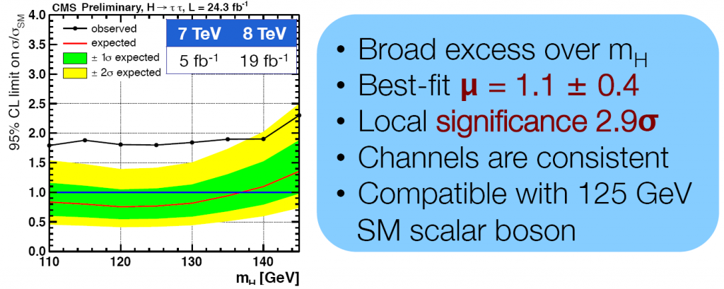
If we have an a priori reason to believe that, for whatever reason, the players are indeed spread out across several buildings, then we can indeed not expect to see a sharp peak at #4 (or whichever building is assigned to the Globetrotters); instead, we should see a broad excess, just what the CMS experiment is seeing when it measured the decay of the presumed Higgs boson into a τ+τ pair.

So is there an a priori reason for the data to be spread out like this? I believe there is. No instrument detects τ leptons directly, as their lifetime is too short. Instead, τ events are reconstructed from decay products, and all forms of τ decay involve at least one neutrino, which may carry away a significant portion of the lepton’s energy. So the final uncertainty in the total measured energy of the τ+τ pair can be quite significant.

In other words, many of the Globetrotters may indeed be sleeping in the wrong building.

Nonetheless, as my copy of the venerable 20-year old book, The Higgs Hunter’s Guide suggests, the decay into τ leptons can be a valuable means of confirmation. Which is perhaps why it is troubling that for now, the other major detector at the LHC, ATLAS, failed to see a similar broad excess of τ+τ events near the presumed Higgs mass.

 Posted by at 10:23 am
Mar 142013
 

I have been reading a lot today about the latest news from Europe, the supposed confirmation that the elementary particle observed at CERN may indeed by the Higgs boson.

And while they are probably right, I feel that the strong pronouncements may be a little premature and perhaps unwarranted.

Let me demonstrate my thoughts using a simple example and some pretty pictures.

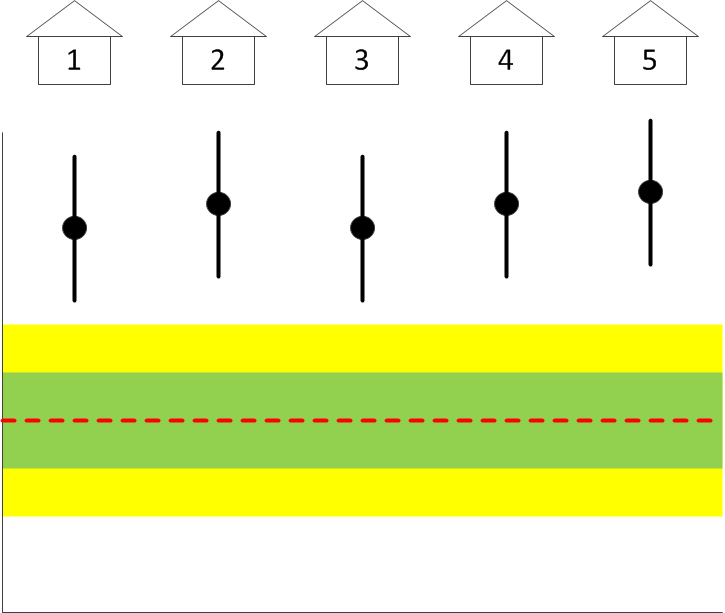
Suppose you go to a camp site. At that camp site there are five buildings, each of the buildings housing a different team. One may be a literary club, another may be a club of chess enthusiasts… but you have reason to believe that one of the buildings is actually occupied by the Harlem Globetrotters.

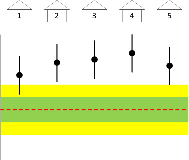
Suppose that the only measurement available to you is a measurement of the average height of the people housed in each of the buildings. You of course know what the mean height and its standard deviation are for the entire population. So then, suppose you are presented with a graph that shows the average height, with error bars, of the people housed in each of five buildings:

The red dashed line is the population average; the green and yellow shaded areas correspond to one and two standard deviations; and the black dots are the actual data points, with standard deviations, representing the average height of the residents in each of the five buildings.

Can you confirm from this diagram that one of the buildings may indeed be housing the Harlem Globetrotters? Can you guess which one? Why, it’s #4. Easy, wasn’t it. It is the only building in which the average height of the residents deviates from the population (background) average significantly, whereas the heights of the residents of all the other buildings are consistent with the “null hypothesis”, namely that they are random people from the population background.

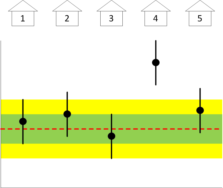
But suppose instead that the graph looks like this:

Can you still tell which building houses the Globetrotters? Guess not. It could be #2… or it could be #4. But if you have other reasons to believe that #4 houses the Globetrotters, you can certainly use this data set as a means of confirmation, even though you are left wondering why #2 also appears perhaps as an outlier. But then, outliers sometimes happen as mere statistical flukes.

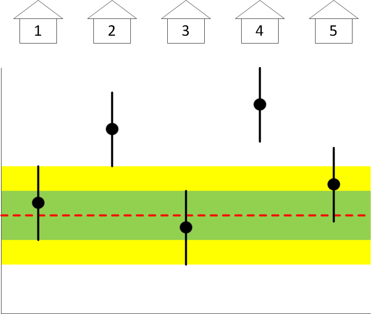
But suppose instead that you see a plot like this one:

What can you conclude from this plot? Can you conclude anything? Is this a real measurement result and perhaps the entire camp site has been taken over by tall basketball players? Or perhaps you have a systematic error in your measurement, using the wrong ruler maybe? You simply cannot tell. More importantly, you absolutely cannot tell whether or not any of the buildings houses the Harlem Globetrotters, much less which one. Despite the fact that building #4 is still about four standard deviations away from the population average. Until you resolve the issue of the systematic, this data set cannot be used to conclude anything.

But then, why are we told that a similar-looking plot, this one indicating the rate of Higgs boson decay into a pair of τ particles (the heaviest cousin of the electron), indicates a “local significance of 2.9σ”? With a “best fit μ = 1.1 ± 0.4” for a 125 GeV Higgs boson?

It indicates no such thing. The only thing this plot actually indicates is the presence of an unexplained systematic bias.

Or am I being stubbornly stupid here?

 Posted by at 10:01 pm
Jan 202013
 

John Marburger had an unenviable role as Director of the United States Office of Science and Technology Policy. Even before he began his tenure, he already faced demotion: President George W. Bush decided not to confer upon him the title “Assistant to the President on Science and Technology”, a title born both by his predecessors and also his successor. Marburger was also widely criticized by his colleagues for his efforts to defend the Bush Administration’s scientific policies. He was not infrequently labeled a “prostitute” or worse.
I met Marburger once in 2006, though to be honest, I don’t recall if I actually conversed with him one-on-one. He gave the keynote address at an international workshop organized by JPL, titled From Quantum to Cosmos: Fundamental Physics Research in Space, which I attended.

If Marburger felt any bitterness towards his colleagues or towards his own situation as a somewhat demoted science advisor, he showed no signs of it during that keynote address. Just as there are no signs of bitterness or resentment in his book, Constructing Reality, which I just finished reading. Nor is there any hint of his own mortality, even though he must have known that his days were numbered by a deadly illness. No, this is a book written by a true scientist: it is about the immortal science that must have been his true passion all along.

It is an ambitious book. In Constructing Reality, Marburger attempts the impossible: explain the Standard Model of particle physics to the interested and motivated lay reader. Thankfully, he does not completely shy away from the math; he realizes that without at least a small amount of mathematics, modern particle physics is just not comprehensible. I admire his (and his publisher’s) courage to face this fact.

Is it a good book? I honestly don’t know. I certainly enjoyed it very much. Marburger demonstrated a thorough, and better yet, intuitive understanding of some of the most difficult aspects of the Standard Model and quantum field theory. But I am the wrong audience: I know the science that he wrote about. (That is not to say that his insight was not helpful in deepening my understanding.) Would this book be useful to the lay reader? Or the aspiring young physicist? I really cannot tell. Learning the principles of quantum field theory is not easy, and in my experience, we each take our own path towards a deeper understanding. Some books help more than others but ultimately, what helps the most is practice: there is no substitute for working out equations on your own. Still, if the positive reviews on Amazon are any indication, Marburger succeeded with writing a book “for [his] friends who are not physicists”.

Marburger died much too soon, at the age of 70, after he lost his battle with cancer. His book was published posthumously (which perhaps explains why the back flap of the book’s dust jacket contains his short bio and room for a photograph above, but no actual photo. Or perhaps I am just imagining things.) But his words survive and inspire others. Well done, Dr. Marburger. And thanks.

 Posted by at 10:37 am
Jan 192013
 

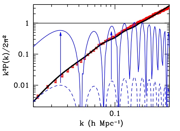
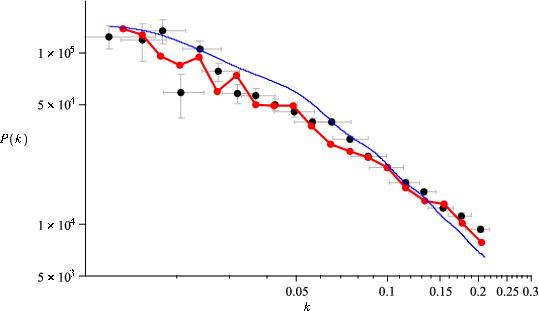
Recently I came across a blog post that suggests (insinuates, even) that proponents of modified gravity ignore the one piece of evidence that “incontrovertibly settles” the question in favor of dark matter. Namely this plot:

From http://arxiv.org/abs/1112.1320 (Scott Dodelson)

From http://arxiv.org/abs/1112.1320 (Scott Dodelson)

In this plot, the red data points represent actual observation; the black curve, the standard cosmology prediction; and the various blue curves are predictions of (modified) gravity without dark matter.

Let me attempt to explain briefly what this plot represents. It’s all about how matter “clumps” in an expanding universe. Imagine a universe filled with matter that is perfectly smooth and homogeneous. As this universe expands, matter in it becomes less dense, but it will remain smooth and homogeneous. However, what if the distribution of matter is not exactly homogeneous in the beginning? Clumps that are denser than average have more mass and hence, more gravity, so these clumps are more able to resist the expansion. In contrast, areas that are underdense have less gravity and a less-than-average ability to resist the expansion; in these areas, matter becomes increasingly rare. So over time, overdense areas become denser, underdense areas become less dense; matter “clumps”.

Normally, this clumping would occur on all scales. There will be big clumps and small clumps. If the initial distribution of random clumps was “scale invariant”, then the clumping remains scale invariant forever.

That is, so long as gravity is the only force to be reckoned with. But if matter in the universe is, say, predominantly something like hydrogen gas, well, hydrogen has pressure. As the gas starts to clump, this pressure becomes significant. Clumping really means that matter is infalling; this means conversion of gravitational potential energy into kinetic energy. Pressure plays another role: it sucks away some of that kinetic energy and converts it into density and pressure waves. In other words: sound.

Yes, it is weird to talk about sound in a medium that is rarer than the best vacuum we can produce here on the Earth, and over cosmological distance scales. But it is present. And it alters the way matter clumps. Certain size scales will be favored over others; the clumping will clearly show preferred size scales. When the resulting density of matter is plotted against a measure of size scale, the plot will clearly show a strong oscillatory pattern.

Cosmologists call this “baryonic acoustic oscillations” or BAO for short: baryons because they represent “normal” matter (like hydrogen gas) and, well, I just explained why they are “acoustic oscillations”.

In the “standard model” of cosmology, baryonic “normal” matter amounts to only about 4% of all the matter-energy content of the visible universe. Of the rest, some 24% is “dark matter”, the rest is “dark energy”. Dark energy is responsible for the accelerating expansion the universe apparently experienced in the past 4-5 billion years. But it is dark matter that determines how matter in general clumped over the eons.

Unlike baryons, dark matter is assumed to be “collisionless”. This means that dark matter has effectively no pressure. There is nothing that could slow down the clumping by converting kinetic energy into sound waves. If the universe had scale invariant density perturbations in the beginning, it will be largely scale invariant even today. In the standard model of cosmology, most matter is dark matter, so the behavior of dark matter will dominate over that of ordinary matter. This is the prediction of the standard model of cosmology, and this is represented by the black curve in the plot above.

In contrast, cosmology without dark matter means that the only matter that there is is baryonic matter with pressure. Hence, oscillations are unavoidable. The resulting blue curves may differ in detail, but they will have two prevailing characteristics: they will be strongly oscillatory and they will also have the wrong slope.

That, say advocates of the standard model of cosmology, is all the proof we need: it is incontrovertible evidence that dark matter has to exist.

Except that it isn’t. And we have shown that it isn’t, years ago, in our paper http://arxiv.org/abs/0710.0364, and also http://arxiv.org/abs/0712.1796 (published in Class. Quantum Grav. 26 (2009) 085002).

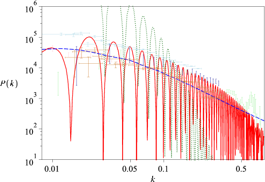
First, there is the slope. The theory we were specifically studying, Moffat’s MOG, includes among other things a variable effective gravitational constant. This variability of the gravitational constant profoundly alters the inverse-square law of gravity over very long distance scales, and this changes the slope of the curve quite dramatically:

From http://arxiv.org/abs/0710.0364 (J. W. Moffat and V. T. Toth)

From http://arxiv.org/abs/0710.0364 (J. W. Moffat and V. T. Toth)

This is essentially the same plot as in Dodelson’s paper, only with different scales for the axes, and with more data sets shown. The main feature is that the modified gravity prediction (the red oscillating line) now has a visually very similar slope to the “standard model” prediction (dashed blue line), in sharp contrast with the “standard gravity, no dark matter” prediction (green dotted line) that is just blatantly wrong.

But what about the oscillations themselves? To understand what is happening there, it is first necessary to think about how the actual data points shown in these plots came into existence. These data points are the result of large-scale galaxy surveys that yielded a three-dimensional data set (sky position being two coordinates, while the measured redshift serving as a stand-in for the third dimension, namely distance) for millions of distant galaxies. These galaxies, then, were organized in pairs and the statistical distribution of galaxy-to-galaxy distances was computed. These numbers were then effectively binned using a statistical technique called a window function. The finite number of galaxies and therefore, the finite size of the bins necessarily introduces an uncertainty, a “smoothing effect”, if you wish, that tends to wipe out oscillations to some extent. But to what extent? Why, that is easy to estimate: all one needs to do is to apply the same window function technique to simulated data that was created using the gravity theory in question:

From http://arxiv.org/abs/0710.0364 (J. W. Moffat and V. T. Toth)

From http://arxiv.org/abs/0710.0364 (J. W. Moffat and V. T. Toth)

This is a striking result. The acoustic oscillations are pretty much wiped out completely except at the lowest of frequencies; and at those frequencies, the modified gravity prediction (red line) may actually fit the data (at least the particular data set shown in this plot) better than the smooth “standard model” prediction!

To borrow a word from the blog post that inspired mine, this is incontrovertible. You cannot make the effects of the window function go away. You can choose a smaller bin size but only at the cost of increasing the overall statistical uncertainty. You can collect more data of course, but the logarithmic nature of this plot’s horizontal axis obscures the fact that you need orders of magnitude (literally!) more data to achieve the required resolution where the acoustic oscillations would be either unambiguously seen or could be unambiguously excluded.

Which leads me to resort to Mark Twain’s all too frequently misquoted words: “The report of [modified gravity’s] death was an exaggeration.”

 Posted by at 11:32 am
Jan 092013
 

BlackHole-tinyA few weeks ago, I exchanged a number of e-mails with someone about the Lanczos tensor and the Weyl-Lanczos equation. One of the things I derived is worth recording here for posterity.

The Lanczos tensor is an interesting animal. It can be thought of as the source of the Weyl curvature tensor, the traceless part of the Riemann curvature tensor. The Weyl tensor, together with the Ricci tensor, fully determine the Riemann tensor, i.e., the intrinsic curvature of a spacetime. Crudely put, whereas the Ricci tensor tells you how the volume of, say, a cloud of dust changes in response to gravity, the Weyl tensor tells you how that cloud of dust is distorted in response to the same gravitational field. (For instance, consider a cloud of dust in empty space falling towards the Earth. In empty space, the Ricci tensor is zero, so the volume of the cloud does not change. But its shape becomes distorted and elongated in response to tidal forces. This is described by the Weyl tensor.

Because the Ricci tensor is absent, the Weyl tensor fully describes gravitational fields in empty space. In a sense, the Weyl tensor is analogous to the electromagnetic field tensor that fully describes electromagnetic fields in empty space. The electromagnetic field tensor is sourced by the four-dimensional electromagnetic vector potential (meaning that the electromagnetic field tensor can be expressed using partial derivatives of the electromagnetic vector potential.) The Weyl tensor has a source in exactly the same sense, in the form of the Lanczos tensor.

The electromagnetic field does not uniquely determine the electromagnetic vector potential. This is basically how integrals vs. derivatives work. For instance, the derivative of the function \(y=x^2\) is given by \(y’=2x\). But the inverse operation is not unambiguous: \(\int 2x~ dx=x^2+C\) where \(C\) is an arbitrary integration constant. This is a recognition of the fact that the derivative of any function in the form \(y=x^2+C\) is \(y’=2x\) regardless of the value of \(C\); so knowing only the derivative \(y’\) does not fully determine the original function \(y\).

In the case of electromagnetism, this freedom to choose the electromagnetic vector potential is referred to as the gauge freedom. The same gauge freedom exists for the Lanczos tensor.

Solutions for the Lanczos tensor for the simplest case of the Schwarzschild metric are provided in Wikipedia. A common characteristic of these solutions is that they yield a quantity that “blows up” at the event horizon. This runs contrary to accepted wisdom, namely that the event horizon is not in any way special; a freely falling space traveler would never know that he is crossing it.

But as it turns out, thanks to the gauge freedom of the Lanczos tensor, it is easy to construct a solution (an infinite family of solutions, as a matter of fact) that do not behave like this at the horizon.

Well, it was a fun thing to compute anyway.

 Posted by at 3:08 pm
Jan 042013
 
Carr, Science 2013; 339:42-43

Carr, Science 2013; 339:42-43

No, the title of this entry is not in reference to another miserably cold Ottawa winter (it’s not that cold, actually; I’ve seen a lot worse) but the absolute temperature scale.

Remember back in high school, when you were first taught that nothing can be colder than 0 degrees Kelvin? Well… you can’t say that anymore.

There are a variety of ways of formulating thermodynamics. Perhaps the cleanest is axiomatic thermodynamics, in which simple relationships like the conservation of energy or the existence of irreversible processes is codified in the form of axioms. One such axiom is often referred to as the Third Law of Thermodynamics; in essence, it postulates that a “ground state” of zero entropy exists, and associates this ground state with the start of the absolute temperature scale.

A little messier is classical statistical physics, where temperature is defined as the average kinetic energy per degree of freedom. Still, since kinetic energy cannot be negative, its average cannot be negative either, so it’s clear that there exists a lowest possible temperature at which all classical particles are at rest.

But statistical physics leads to another way of looking at temperature: as a means of calculating probabilities. The probability \(P_i\) of finding a particle in a state \(i\) with kinetic energy \(E_i\) will be proportional to the Boltzmann distribution:

$$P_i\propto e^{-E_i/kT},$$

where \(k\) is Boltzmann’s constant ant \(T\) is the temperature.

And here is where things get really interesting. For if it is possible to create an ensemble of particles in which \(P_i\) follows a positive exponential distribution, that clearly implies a negative temperature \(T\).

And this is precisely what has been reported in Science this week by Braun et al. (Science 2013; 339:52-55): an experimentally realized state of ultracold bosons with a distribution of kinetic (motional) energy states that follows a positive exponential curve. In other words… matter at temperature below 0 K.

How about that for a bit of 21st century physics.

 Posted by at 7:16 am
Dec 202012
 

I have received a surprising number of comments to my recent post on the gravitational potential, including a criticism: namely that what I am saying is nonsense, that in fact it is well known (there is actually a resolution by the International Astronomical Union to this effect) that in the vicinity of the Earth, the gravitational potential is well approximated using the Earth’s multipole plus tidal contributions, and that the potential, therefore, is determined primarily by the Earth itself, the Sun only playing a minor role, contrary to what I was blabbering about.

But this is precisely the view of gravity that I was arguing against. As they say, a picture is worth a thousand words, so let me try to demonstrate it with pictures, starting with this one:

It is a crude one-dimensional depiction of the Earth’s gravity well (between the two vertical black lines) embedded in the much deeper gravity well (centered) of the Sun. In other words, what I depicted is the sum of two gravitational potentials:

$$U=-\frac{GM}{R}-\frac{Gm}{r}.$$

Let me now zoom into the area marked by the vertical lines for a better view:

It looks like a perfectly ordinary gravitational potential well, except that it is slightly lopsided.

So what if I ignored the Sun’s potential altogether? In other words, what if I considered the potential given by

$$U=-\frac{Gm}{r}+C$$

instead, where \(C\) is just some normalization constant to ensure that I am comparing apples to apples here? This is what I get:

The green curve approximates the red curve fairly well deep inside the potential well but fails further out.

But wait a cotton-picking minute. When I say “approximate”, what does that tell you? Why, we approximate curves with Taylor series, don’t we, at least when we can. The Sun’s gravitational potential, \(-GM/R\), near the vicinity of the Earth located at \(R=R_0\), would be given by the approximation

$$-\frac{GM}{R}=-\frac{GM}{R_0}+\frac{GM}{R_0^2}(R-R_0)-\frac{GM}{R_0^3}(R-R_0)^2+{\cal O}\left(\frac{GM}{R_0^4}[R-R_0]^3\right).$$

And in this oversimplified one-dimensional case, \(r=R-R_0\) so I might as well write

$$-\frac{GM}{R}=-\frac{GM}{R_0}+\frac{GM}{R_0^2}r-\frac{GM}{R_0^3}r^2+{\cal O}\left(\frac{GM}{R_0^4}r^3\right).$$

(In the three-dimensional case, the math gets messier but the principle remains the same.)

So when I used a constant previously, its value would have been \(C=-GM/R_0\) and this would be just the zeroeth order term in the Taylor series expansion of the Sun’s potential. What if I include more terms and write:

$$U\simeq-\frac{Gm}{r}-\frac{GM}{R_0}+\frac{GM}{R_0^2}r-\frac{GM}{R_0^3}r^2?$$

When I plot this, here is what I get:

The blue curve now does a much better job approximating the red one. (Incidentally, note that if I differentiate by \(r\) to obtain the acceleration, I get: \(a=-dU/dr=-Gm/r^2-GM/R_0^2+2GMr/R_0^3\), which is the sum of the terrestrial acceleration, the solar acceleration that determines the Earth’s orbit around the Sun, and the usual tidal term. So this is another way to derive the tidal term. But, I digress.)

The improvement can also be seen if I plot the relative error of the green vs. blue curves:

So far so good. But the blue curve still fails miserably further outside. Let me zoom back out to the scale of the original plot:

Oops.

So while it is true that in the vicinity of the Earth, the tidal potential is a useful approximation, it is not the “real thing”. And when we perform a physical experiment that involves, e.g., a distant spacecraft or astronomical objects, the tidal potential must not be used. Such experiments, for instance tests measuring gravitational time dilation or the gravitational frequency shift of an electromagnetic signal are readily realizable nowadays with precision equipment.

But it just occurred to me that even at the pure Newtonian level, the value of the potential \(U\) plays an observable role: it determines the escape velocity. A projectile escapes to infinity if its overall energy (kinetic plus potential) is greater than zero: \(mv^2/2 + mU>0\). In other words, the escape velocity \(v\) is determined by the formula

$$v>\sqrt{-2U}.$$

The escape velocity works both ways; it also tells you the velocity to which an object accelerates as it falls from infinity. So suppose you let lose a rock somewhere in deep space far from the Sun and it falls towards the Earth. Its velocity at impact will be 43.6 km/s… without the Sun’s influence, its impact velocity would have been only 11.2 km/s.

So using somewhat more poetic language, the relationship of us, surface dwellers, to distant parts of the universe, is determined primarily not by the gravity of the planet on which we stand, but by the gravitational field of our Sun… or maybe our galaxy… or maybe the supercluster of which our galaxy is a member.

As I said in my preceding post… gravity is weird.


The following gnuplot code, which I am recording here for posterity, was used to produce the plots in this post:

set terminal gif size 320,240
unset border
unset xtics
unset ytics
set xrange [-5:5]
set yrange [-5:0]
set output 'pot0.gif'
set arrow from 0.5,-5 to 0.5,0 nohead lc rgb 'black' lw 0.1
set arrow from 1.5,-5 to 1.5,0 nohead lc rgb 'black' lw 0.1
plot -1/abs(x)-0.1/abs(x-1) lw 3 notitle
unset arrow
set xrange [0.5:1.5]
set output 'pot1.gif'
plot -1/abs(x)-0.1/abs(x-1) lw 3 notitle
set output 'pot2.gif'
plot -1/abs(x)-0.1/abs(x-1) lw 3 notitle,-0.1/abs(x-1)-1 lw 3 notitle
set output 'pot3.gif'
plot -1/abs(x)-0.1/abs(x-1) lw 3 notitle,-0.1/abs(x-1)-1 lw 3 notitle,-0.1/abs(x-1)-1+(x-1)-(x-1)**2 lw 3 notitle
set xrange [-5:5]
set output 'pot4.gif'
set arrow from 0.5,-5 to 0.5,0 nohead lc rgb 'black' lw 0.1
set arrow from 1.5,-5 to 1.5,0 nohead lc rgb 'black' lw 0.1
replot
unset arrow
set output 'potdiff.gif'
set xrange [0.5:1.5]
set yrange [*:*]
plot 0 notitle,\
((-1/abs(x)-0.1/abs(x-1))-(-0.1/abs(x-1)-1))/(-1/abs(x)-0.1/abs(x-1)) lw 3 notitle,\
((-1/abs(x)-0.1/abs(x-1))-(-0.1/abs(x-1)-1+(x-1)-(x-1)**2))/(-1/abs(x)-0.1/abs(x-1)) lw 3 notitle
 Posted by at 3:04 pm
Dec 182012
 

schwarzThere is something curious about gravity in general relativity. Specifically, the gravitational potential.

In high school, we were taught about this mysterious thing called “potential energy” or “gravitational potential”, but we were always assured that it’s really just the difference between potentials that matters. For instance, when you drop a stone from a tall tower, its final velocity (ignoring air resistance) is determined by the difference in gravitational potential energy at the top and at the bottom of the tower. If you study more sophisticated physics, you eventually learn that it’s not the gravitational potential, only its gradient that has physically observable meaning.

Things are different in general relativity. The geometry of spacetime, in particular the metric and its components are determined by the gravitational potential itself, not its gradient. In particular, we have

$$
g_{00} = 1 – \frac{2GM}{c^2r}
$$

in the infamous Schwarzschild metric, where \(g\) is the metric tensor, \(G\) is the universal gravitational constant, \(c\) is the speed of light, \(M\) is the mass of the gravitating object, and \(r\) is the distance from it. Since the Newtonian gravitational field is given by \(U=-GM/r\), this means

$$
g_{00} = 1 – \frac{2}{c^2}U.
$$

This quantity has physical significance. For instance, the angle by which light is deflected when it passes near a star is given by \(4c^{-2}U\).

So then, what is the value of \(U\) here on the surface of the Earth? Why, it’s easy. The mass of the Earth is \(M_E=6\times 10^{24}\) kg, its radius is roughly \(R_E=6.37\times 10^6\) m, so

$$
\frac{1}{c^2}U_E=\frac{GM_E}{c^2R_E} \simeq 7\times 10^{-10}.
$$

You could be forgiven for thinking that this is the right answer, but it really isn’t. For let’s just calculate the gravitational potential of the Sun as felt here on the Earth. Yes, I know, the Sun is quite a distance away and all, but play along, will you.

The mass of the Sun is \(M_\odot=2\times 10^{30}\) kg, its distance from the Earth is \(R_\odot=1.5\times 10^{11}\) m. So for the Sun,

$$
\frac{1}{c^2}U_\odot=\frac{GM_\odot}{c^2R_\odot} \simeq 10^{-8}.
$$

Whoops! This is more than an order of magnitude bigger than the Earth’s own gravitational potential! So right here, on the surface of the Earth, \(U\) is dominated by the Sun!

Or is it? Let’s just quickly check what the gravitational potential of the Milky Way is here on the Earth. The Sun is zipping around the center in what we believe is a roughly circular orbit, at a speed of 250 km/s. We know that for a circular orbit, the velocity is \(v_\star=\sqrt{GM_\star/R_\star}=\sqrt{U_\star}\), so

$$
\frac{1}{c^2}U_\star = \frac{v_\star^2}{c^2} \simeq 7\times 10^{-7}.
$$

This is almost two orders of magnitude bigger than the gravitational potential due to the Sun! So here, on the surface of the Earth, the gravitational potential is dominated by the large concentration of mass near the center of the Milky Way, some 8 kiloparsecs (25 thousand light years) from here. Wow!

But wait a minute, is this the end? There is the Local Supercluster of galaxies of which the Milky Way is part. Its mass \(M_V\) is believed to be about \(10^{15}\) times the mass of the Sun, and it is believed to be centered near the Virgo cluster, about 65 million light years or about \(R_V=6.5\times 10^{23}\) meters away. So (this is necessarily a crude estimate, but it will serve as an order-of-magnitude value):

$$
\frac{1}{c^2}U_V=\frac{GM_V}{c^2R_V} \simeq 2.3\times 10^{-6}.
$$

This value for the gravitational potential right here on the Earth’s surface, astonishingly, is more than 3,000 times the gravitational potential due to the Earth’s own mass. Is this the end? Or would more distant objects exert an even greater influence on the gravitational field here on the Earth? The answer is the latter. That is because as we look further into the distant universe, the amount of mass we see goes up by the square of the distance, but their gravitational influence goes down by only the first power of the distance. So if you look at 10 times the distance, you will see 100 times as much matter; the gravitational influence of each unit of matter will decrease by a factor of 10 but overall, with a hundred times as much mass, the total gravitational influence will still go up tenfold.

So the local gravitational field is dominated by the most distant matter in the universe.

And by local gravitational field, I of course mean the local metric, which in turn determines how light is deflected, how clocks slow down, how the wavelength of photons shifts.

Insanely, we may not even know how fast a “true” clock in our universe runs, one that is free of gravitational influences, because we don’t know the actual magnitude of the sum total of all gravitational influences here on the Earth.

Gravity is weird.

 Posted by at 4:34 pm
Dec 032012
 

Update (September 6, 2013): The analysis in this blog entry is invalid. See my September 6, 2013 blog entry on this topic for an explanation and update.

It has been a while since I last wrote about a pure physics topic in this blog.

A big open question these days is whether or not the particle purportedly discovered by the Large Hadron Collider is indeed the Higgs boson.

One thing about the Higgs boson is that it is a spin-0 scalar particle: this means, essentially, that the Higgs is identical to its mirror image. This distinguishes the Higgs from pseudoscalar particles that “flip” when viewed in a mirror.

So then, one way to distinguish the Higgs from other possibilities, including so-called pseudoscalar resonances, is by establishing that the observed particle indeed behaves either like a scalar or like a pseudoscalar.

Easier said than done. The differences in behavior are subtle. But it can be done, by measuring the angular distribution of decay products. And this analysis was indeed performed using the presently available data collected by the LHC.

Without further ado, here is one view of the data, taken from a November 14, 2012 presentation by Alexey Drozdetskiy:

The solid red line corresponds to a scalar particle (denoted by 0+); the dotted red line to a pseudoscalar (0−). The data points represent the number of events. The horizontal axis represents a “Matrix Element Likelihood Analysis” value, which is constructed using a formula similar to this one (see arXiv:1208.4018 by Bolognesi et al.):

$${\cal D}_{\rm bkg}=\left[1+\frac{{\cal P}_{\rm bkg}(m_{4\ell};m_1,m_2,\Omega)}{{\cal P}_{\rm sig}(m_{4\ell};m_1,m_2,\Omega)}\right]^{-1},$$

where the \({\cal P}\)-s represent probabilities associated with the background and the signal.

So far so good. The data are obviously noisy. And there are not that many data points: only 10, representing 16 events (give or take, as the vertical error bars are quite significant).

There is another way to visualize these values: namely by plotting them against the relative likelihood that the observed particle is 0+ or 0−:

In this fine plot, the two Gaussian curves correspond to Monte-Carlo simulations of the scalar and pseudoscalar scenarios. The position of the green arrow is somehow representative of the 10 data points shown in the preceding plot. The horizontal axis in this case is the logarithm of a likelihood ratio.

On the surface of it, this seems to indicate that the observed particle is indeed a scalar, just like the Higgs. So far so good, but what bothers me is that this second plot does not indicate uncertainties in the data. Yet, judging by the sizable vertical error bars in the first plot, the uncertainties are significant.

However, to relate the uncertainties in the first plot, one has to be able to relate the likelihood ratio on this plot to the MELA value on the preceding plot. Such a relationship indeed exists, given by the formula

$${\cal L}_k=\exp(-n_{\rm sig}-n_{\rm bkg})\prod_i\left(n_{\rm sig}\times{\cal P}^k_{\rm sig}(x_i;\alpha;\beta)+n_{\rm bkg}\times{\cal P}_{\rm bkg}(x_i;\beta)\right).$$

The problem with this formula, from my naive perspective, is that in order to replicate it, I would need to know not only the number of candidate signal events but also the number of background events, and also the associated probability distributions and values for \(\alpha\) and \(\beta\). I just don’t have all the information necessary to reconstruct this relationship numerically.

But perhaps I don’t have to. There is a rather naive thing one can do: and that would be simply calculating the weighted average of the data points in the first plot. When I do this, I get a value of 0.57. Lo and behold, it has roughly the same relationship to the solid red Gaussian in that plot as the green arrow to the 0+ Gaussian in the second.

Going by the assumption that my naive shortcut actually works reasonably well, I can take the next step. I can calculate a \(1\sigma\) error on the weighted average, which yields \(0.57^{+0.24}_{-0.23}\). When I (admittedly very crudely) try the transcribe this uncertainty to the second plot, I get something like this:

Yes, the error is this significant. So while the position of the green arrow is in tantalizing agreement with what one would expect from a Higgs particle, the error bar says that we cannot draw any definitive conclusions just yet.

But wait, it gets even weirder. Going back to the first plot, notice the two data points on the right. What if these are outliers? If I remove them from the analysis, I get something completely different: namely, the value of \(0.43^{+0.26}_{-0.21}\). Which is this:

So without the outliers, the data actually favor the pseudoscalar scenario!

I have to emphasize: what I did here is rather naive. The weighted average may not accurately represent the position of the green arrow at all. The coincidence in position could be a complete accident. In which case the horizontal error bar yielded by my analysis is completely bogus as well.

I also attempted to check how much more data would be needed to reduce the size of these error bars sufficiently for a true \(1\sigma\) result: about 2-4 times the number of events collected to date. So perhaps what I did is not complete nonsense after all, because this is what knowledgeable people are saying: when the LHC collected at least twice the amount of data it already has, we may know with reasonable certainty if the observed particle is a scalar or a pseudoscalar.

Until then, I hope I did not make a complete fool of myself with this naive analysis. Still, this is what blogs are for; I am allowed to say foolish things here.

 Posted by at 10:31 pm
Nov 302012
 

An article we wrote with Slava Turyshev about the Pioneer anomaly and its resolution, at the request of IEEE Spectrum, is now available online.

It was an interesting experience, working with a professional science journalist and her team. I have to admit that I did not previously appreciate the level of professionalism that is behind such a “members only” magazine.

 Posted by at 3:22 pm
Oct 152012
 

This is not some fringe moron but a Republican representative for Georgia’s 10th district. Member of the Tea Party caucus. And a physician to boot:

Groan. I guess I must be a servant of the Devil then (go, Lucifer!) as I, too, spread the “lie from the pit of hell” called the Big Bang theory. Or the lie called “evolution”. Or the lie called “embryology” (that’s a new one for me; would you know what’s wrong with embryology from a Tea Party perspective?) What next, write down the Friedmann equations, be burned at the stake?

Now this is why, even if everything you told me about Obama and his Chicago lot was the gospel truth, I’d still prefer them over Republicans these days. I’d rather take 21st century corruption than go back to the Middle Ages.

Part of me wonders (hopes, even) that this is just a cynical attempt to attract votes and he is not actually this stone dumb stupid. But I don’t know what it says about the Republican party these days if these are the kinds of votes its representatives go after.

 Posted by at 12:22 pm