I’ve been hesitant to write about this, as skeptics will already have plenty to gripe about, I don’t need to pile on. And I swear I am not looking for excuses to bash the IPCC, not to mention that I have little sympathy or patience for skeptics who believe that an entire body of science is just one huge scam to make Al Gore and his buddies rich.
But… I was very disappointed to see plots in the latest IPCC “Summary for Policymakers” report that appear unnecessarily manipulative.
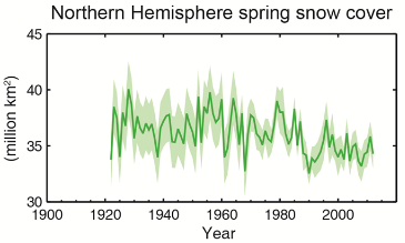
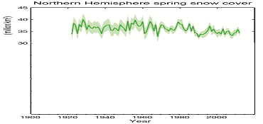
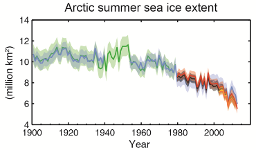
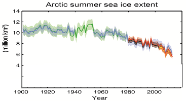
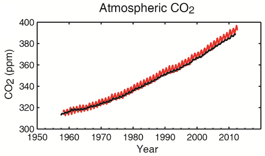
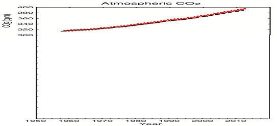
Wikipedia describes these as truncated or “gee-whiz” graphs: graphs in which the vertical axis does not start at zero. This can dramatically change the appearance of a plot, making small variations appear much larger than they really are.
To be clear, the use of truncated plots is often legitimate. Perhaps the plot compares two quantities that are of a similar magnitude. Perhaps the plot shows a quantity the absolute magnitude of which is irrelevant. Perhaps the quantity is such that “0” has no special meaning or it is not a natural start of the range (e.g., pH, temperature in Centigrade).
But in other cases, this practice can be viewed as misleading, intellectually dishonest (for instance, it is common for financial companies to manipulate plots this way to make their market performance appear more impressive than it really is) or outright fraudulent.
So here we are, the 2013 IPCC report’s summary for policymakers has been released in draft form, and what do I see in it? Several key plots that have been presented in truncated “gee-whiz” form, despite the fact that the quantities they represent are such that their absolute magnitudes are relevant, that their variability must be measured against their absolute magnitudes, and where zero is a natural start of the range.
I am presenting the original plots on the left and my crudely “untruncated” versions on the right:
 |
 |
 |
 |
 |
 |
This is not kosher, especially in a document that is intended for consumption by a lay audience who may not have the scientific education to spot such subtleties.
The document is still labeled a draft, with copy editing in particular yet to take place. Here’s to hoping that these plots (and any similar plots that may appear in the main report) are corrected before publication, to avoid the impression of trying to exaggerate the case for climate change. Scientists should be presenting the science objectively and leave the manipulation, even inadvertent manipulation, to politicians.