Update (September 6, 2013): The analysis in this blog entry is invalid. See my September 6, 2013 blog entry on this topic for an explanation and update.
It has been a while since I last wrote about a pure physics topic in this blog.
A big open question these days is whether or not the particle purportedly discovered by the Large Hadron Collider is indeed the Higgs boson.
One thing about the Higgs boson is that it is a spin-0 scalar particle: this means, essentially, that the Higgs is identical to its mirror image. This distinguishes the Higgs from pseudoscalar particles that “flip” when viewed in a mirror.
So then, one way to distinguish the Higgs from other possibilities, including so-called pseudoscalar resonances, is by establishing that the observed particle indeed behaves either like a scalar or like a pseudoscalar.
Easier said than done. The differences in behavior are subtle. But it can be done, by measuring the angular distribution of decay products. And this analysis was indeed performed using the presently available data collected by the LHC.
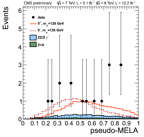
Without further ado, here is one view of the data, taken from a November 14, 2012 presentation by Alexey Drozdetskiy:
The solid red line corresponds to a scalar particle (denoted by 0+); the dotted red line to a pseudoscalar (0−). The data points represent the number of events. The horizontal axis represents a “Matrix Element Likelihood Analysis” value, which is constructed using a formula similar to this one (see arXiv:1208.4018 by Bolognesi et al.):
$${\cal D}_{\rm bkg}=\left[1+\frac{{\cal P}_{\rm bkg}(m_{4\ell};m_1,m_2,\Omega)}{{\cal P}_{\rm sig}(m_{4\ell};m_1,m_2,\Omega)}\right]^{-1},$$
where the \({\cal P}\)-s represent probabilities associated with the background and the signal.
So far so good. The data are obviously noisy. And there are not that many data points: only 10, representing 16 events (give or take, as the vertical error bars are quite significant).
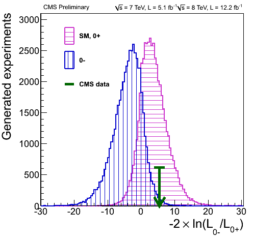
There is another way to visualize these values: namely by plotting them against the relative likelihood that the observed particle is 0+ or 0−:
 In this fine plot, the two Gaussian curves correspond to Monte-Carlo simulations of the scalar and pseudoscalar scenarios. The position of the green arrow is somehow representative of the 10 data points shown in the preceding plot. The horizontal axis in this case is the logarithm of a likelihood ratio.
On the surface of it, this seems to indicate that the observed particle is indeed a scalar, just like the Higgs. So far so good, but what bothers me is that this second plot does not indicate uncertainties in the data. Yet, judging by the sizable vertical error bars in the first plot, the uncertainties are significant.
However, to relate the uncertainties in the first plot, one has to be able to relate the likelihood ratio on this plot to the MELA value on the preceding plot. Such a relationship indeed exists, given by the formula
$${\cal L}_k=\exp(-n_{\rm sig}-n_{\rm bkg})\prod_i\left(n_{\rm sig}\times{\cal P}^k_{\rm sig}(x_i;\alpha;\beta)+n_{\rm bkg}\times{\cal P}_{\rm bkg}(x_i;\beta)\right).$$
The problem with this formula, from my naive perspective, is that in order to replicate it, I would need to know not only the number of candidate signal events but also the number of background events, and also the associated probability distributions and values for \(\alpha\) and \(\beta\). I just don’t have all the information necessary to reconstruct this relationship numerically.
But perhaps I don’t have to. There is a rather naive thing one can do: and that would be simply calculating the weighted average of the data points in the first plot. When I do this, I get a value of 0.57. Lo and behold, it has roughly the same relationship to the solid red Gaussian in that plot as the green arrow to the 0+ Gaussian in the second.
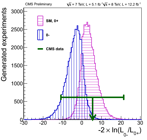
Going by the assumption that my naive shortcut actually works reasonably well, I can take the next step. I can calculate a \(1\sigma\) error on the weighted average, which yields \(0.57^{+0.24}_{-0.23}\). When I (admittedly very crudely) try the transcribe this uncertainty to the second plot, I get something like this:
 Yes, the error is this significant. So while the position of the green arrow is in tantalizing agreement with what one would expect from a Higgs particle, the error bar says that we cannot draw any definitive conclusions just yet.
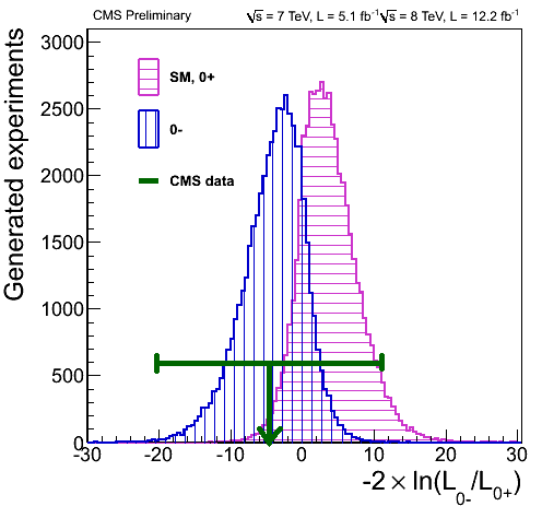
But wait, it gets even weirder. Going back to the first plot, notice the two data points on the right. What if these are outliers? If I remove them from the analysis, I get something completely different: namely, the value of \(0.43^{+0.26}_{-0.21}\). Which is this:
 So without the outliers, the data actually favor the pseudoscalar scenario!
I have to emphasize: what I did here is rather naive. The weighted average may not accurately represent the position of the green arrow at all. The coincidence in position could be a complete accident. In which case the horizontal error bar yielded by my analysis is completely bogus as well.
I also attempted to check how much more data would be needed to reduce the size of these error bars sufficiently for a true \(1\sigma\) result: about 2-4 times the number of events collected to date. So perhaps what I did is not complete nonsense after all, because this is what knowledgeable people are saying: when the LHC collected at least twice the amount of data it already has, we may know with reasonable certainty if the observed particle is a scalar or a pseudoscalar.
Until then, I hope I did not make a complete fool of myself with this naive analysis. Still, this is what blogs are for; I am allowed to say foolish things here.

[…] december, I wrote a blog entry in which I criticized one aspect of the LHC’s analysis of the scalar particle discovered […]