I am reading a very interesting paper by Christian Beck, recently published in Physical Review Letters.
Beck revives the proposal that at least some of the as yet unobserved dark matter in the universe may be in the form of axions. But he goes further: he suggests that a decade-old experiment with superconducting Josephson-junctions that indicated the presence of a small, unexplained signal may in fact have been a de facto measurement of the axion background in our local galactic neighborhood.
If true, Beck’s suggestion has profound significance: not only would dark matter be observable, but it can be observed with ease, using a tabletop experiment!
What is an axion? The Standard Model of particle physics (for a very good comprehensive review, I recommend The Standard Model: A Primer by Cliff Burgess and Guy Moore, Cambridge University Press, 2007) can be thought of as the most general theory based on the observed particle content in the universe. By “most general”, I mean specifically that the Standard Model can be written in the form of a Lagrangian density, and all the terms that can be present do, in fact, correspond to physically observable phenomena.
All terms except one, that is. The term, which formally reads
\begin{align}{\cal L}_\Theta=\Theta_3\frac{g_3^2}{64\pi^2}\epsilon^{\mu\nu\lambda\beta}G^\alpha_{\mu\nu}G_{\alpha\lambda\beta},\end{align}
where \(G\) represents gluon fields and \(g_3\) is the strong coupling constant (\(\epsilon^{\mu\nu\lambda\beta}\) is the fully antisymmetric Levi-Civita pseudotensor), does not correspond to any known physical process. This term would be meaningless in classical physics, on account of the fact that the coupling constant \(\Theta_3\) multiplies a total derivative. In QCD, however, the term still has physical significance. Moreover, the term actually violates charge-parity (CP) symmetry.
The fact that no such effects are observed implies that \(\Theta_3\) is either 0 or at least, very small. Now why would \(\Theta_3\) be very small? There is no natural explanation.
However, one can consider introducing a new scalar field into the theory, with specific properties. In particular this scalar field, which is called the axion and usually denoted by \(a\), causes \(\Theta_3\) to be replaced with \(\Theta_{3,{\rm eff}}=\Theta_3 + \left<a\right>/f_a\), where \(f_a\) is some energy scale. If the scalar field were massless, the theory would demand \(\left<a\right>/f_a\) to be exactly \(-\Theta_3\). However, if the scalar field is massive, a small residual value for \(\Theta_{3,{\rm eff}}\) remains.
As for the Josephson-junction, it is a superconducting device in which two superconducting layers are separated by an isolation layer (which can be a normal conductor, a semiconductor, or even an insulator). As a voltage is introduced across a Josephson-junction, a current can be measured. The peculiar property of a Josephson-junction is the current does not vanish even as the voltage is reduced to zero:

(The horizontal axis is voltage, the vertical axis is the current. In a normal resistor, the current-voltage curve would be a straight line that goes through the origin.) This is the DC Josephson effect; a similar effect arises when an AC voltage is applied, but in that case, the curve is even more interesting, with a step function appearance.
The phase difference \(\delta\) between the superconductors a Josephson-junction is characterized by the equation
\begin{align}\ddot{\delta}+\frac{1}{RC}\dot{\delta}+\frac{2eI_c}{\hbar C}\sin\delta&=\frac{2e}{\hbar C}I,\end{align}
where \(R\) and \(C\) are the resistance and capacitance of the junction, \(I_c\) is the critical current that characterizes the junction, and \(I\) is the current. (Here, \(e\) is the electron’s charge and \(\hbar\) is the reduced Planck constant.)
Given an axion field, represented by \(\theta=a/f_a\), in the presence of strong electric (\({\bf E}\)) and magnetic (\({\bf B}\)) fields, the axion field satisfies the equation
\begin{align}\ddot{\theta}+\Gamma\dot{\theta}+\frac{m_a^2c^4}{\hbar^2}\sin\theta=-\frac{g_\lambda c^3e^2}{4\pi^2f_a^2}{\bf E}{\bf B},\end{align}
where \(\Gamma\) is a damping parameter and \(g_\lambda\) is a coupling constant, while \(m_a\) is the axion mass and of course \(c\) is the speed of light.
The formal similarity between these two equations is striking. Now Beck suggests that the similarity is more than formal: that in fact, under the right circumstances, the axion field and a Josephson-junction can form a coupled system, in which resonance effects might be observed. The reason Beck gives is that the axion field causes a small CP symmetry perturbation in the Josephson-junction, to which the junction reacts with a small response in \(\delta\).
Indeed, Beck claims that this effect was, in fact, observed already, in a 2004 experiment by Hoffman, et al., who attempted to measure the noise in a certain type of Josephson-junction. In their experiment, a small, persistent peak appeared at a voltage of approximately 0.055 mV:
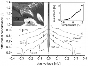
If Beck is correct, this observation corresponds to an axion with a mass of 0.11 meV (that is to say, the electron is some five billion times heavier than this axion) and the local density of the axion field would be about one sixth the presumed dark matter density in this region of the Galaxy.
I don’t know if Beck is right or not, but unlike most other papers about purported dark matter discoveries, this one does not feel like clutching at straws. It passes the “smell test”. I’d be very disappointed if it proved to be true (I am not very much in favor of the dark matter proposal) but if it is true, I think it qualifies as a Nobel-worthy discovery. It is also eerily similar to the original discovery of the cosmic microwave background: it was first observed by physicists who were not at all interested in cosmology but instead, were just trying to build a low-noise microwave antenna.



 Damn it’s cold this morning. Negative 26 Centigrade. Or 27 if I believe the local news. And it’s not even winter yet!

 It’s only November, for crying out loud, but winter has arrived with a vengeance.
 When you have a family member who is gravely ill, you may not have the stamina to pay attention to other things. When you have a family pet that is gravely ill, it’s almost as bad (actually, in some ways it’s worse, as a pet cannot tell what hurts and you cannot explain to the pet why unpleasant medication is necessary or discuss with the pet the available treatment options.)
 Reader’s Digest recently conducted



 One of the giants of the golden era of science-fiction, indeed a co-author of one of the most influential science-fiction novels of all time, The Space Merchants, passed away yesterday, just a few weeks shy of his 94th birthday.
