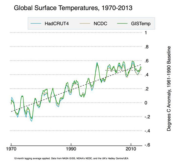
It is now formally official: global surface temperatures did not increase significantly in the past 15 years or so.
But if skeptics conclude that this is it, the smoking gun that proves that all climate science is hogwash, they better think again. When we look closely, the plots reveal something a lot more interesting.
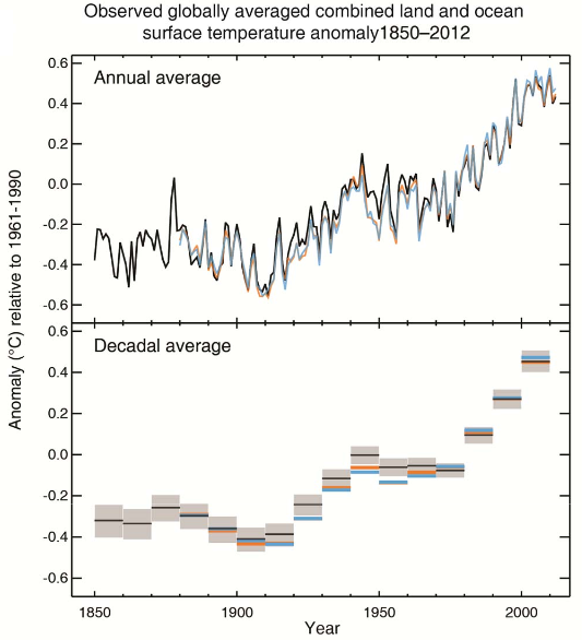
For starters… this is not the first time global temperatures stagnated or even decreased somewhat since the start of recordkeeping. There is a roughly 20-year period centered around 1950 or so, and another, even longer period centered roughly around 1890. This looks in fact like evidence that there may be something to the idea of a 60-year climate cycle. However, the alarming bit is this: every time the cycle peaks, temperatures are higher than in the previous cycle.
The just released IPCC Summary for Policymakers makes no mention of this cycle but it does offer an explanation for the observed stagnating temperatures. These are probably a result of volcanic activity, they tell us, the solar cycle, and perhaps mismodeling the effects of greenhouse gases and aerosols, but they are not exactly sure.
And certainty is characterized with words like “high confidence,” “medium confidence” and such, with no definitions given. These will be supplied, supposedly, in the technical report that will be released on Monday. Nonetheless, the statement that “Probabilistic estimates […] are based on statistical analysis of observations or model results, or both, and expert judgment” [emphasis mine] does not fill me with confidence, if you will pardon the pun.
In fact, I feel compelled to compare this to the various reports and releases issued by the LHC in recent years about the Higgs boson. There was no “expert judgment”. There were objective statistical analysis methods and procedures that were thoroughly documented (even though they were often difficult to comprehend, due to their sheer complexity.) There were objective standards for claiming a discovery.
Given the extreme political sensitivity of the topic, I think the IPCC should adopt similar or even more stringent standards of analysis as the LHC. Do away with “expert judgment” and use instead proper statistical tools to establish the likelihood of specific climate models in the light of the gathered data. And if the models do not work, e.g., if they failed to predict stagnating temperatures, the right thing to do is say that this is so; there is no need for “expert judgment”. Just state the facts.
 It’s official (well, sort of): global warming