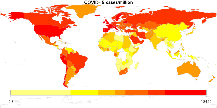
I suppose the most important thing to know about COVID-19 is not so much the total number of cases or deaths, but the number of cases or deaths per million people. A number like 1,000 deaths is huge in a country of one million, a drop in the bucket in a country like India or China.
In that vein, I produced two maps using my rather rusty R programming skills. I am sure I could have done a better job labeling the legend, but there is only so much time I wanted to spend on this. The color bar legend is logarithmic between its two end values.
First, the cumulative number of cases per million people (May 22 data):
Next, deaths per million:
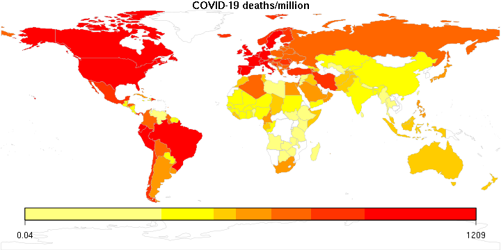
Not a pretty picture. It appears that the countries that are the most disproportionately affected (or the most likely to offer accurate reports?) are in Europe (including Russia), North and South America and the Middle East.
But now, here is perhaps the scariest map of all:
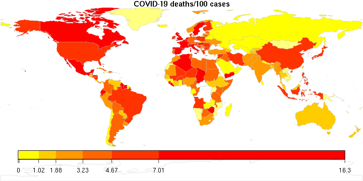
Yes, in many countries more than 10% of the confirmed cases result in death. The global average is 6.4 per 100 confirmed cases. The fact that COVID-19 is deadly in countries with underdeveloped health care systems is perhaps understandable, but the fact that the reddest parts of the map are places with the most sophisticated health care systems in the world is food for thought.