Maps that show the spread and mortality rate of COVID-19 are worrisome, to say the least.
So here is something slightly more encouraging: the day-to-day growth rate of COVID-19 infections, in the world, the United States, Canada, and the province of Ontario where I live.
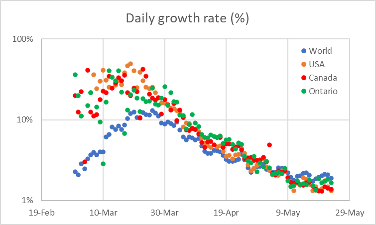
What this plot shows is that the growth rate has been consistently and steadily decreasing (note that the vertical axis is logarithmic). Furthermore, the overall behavior of the worldwide, US, and Canadian plots is remarkable similar.
Of course this plot is also a reflection of the fact that the cumulative number of cases increases, so even if the number of new cases remains steady, the growth rate will indeed decrease. Nonetheless, it demonstrates that at least for now, the pandemic’s exponential spread has been arrested. This can, of course, change for the worse quite dramatically if we lose our collective patience and start relaxing too soon.