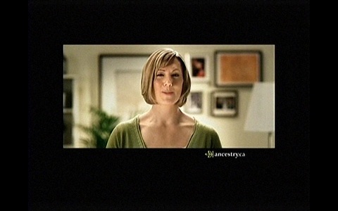
This is something I griped about before. Moments ago, I saw the following picture on the CBC Newsworld analog cable channel:
Yes, it does look like a ridiculous amount of blackness surrounding a small-ish picture. It turns out that I was looking at…
- a standard-definition (4:3) broadcast signal on a 16:10 widescreen monitor, containing…
- widescreen (16:9) original material letterboxed into the standard-definition (4:3) frame, containing in turn…
- standard definition (4:3) material letterboxed into a wide-screen (16:9) frame, that in turn contained…
- widescreen (16:9) original material.
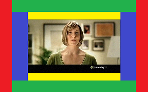
Confusing? Well, perhaps this picture clarifies it a little bit:
- The yellow bars at the top and bottom were added when the original 16:9 material was letterboxed into a 4:3 standard-definition frame;
- The blue bars on the sides were added when this 4:3 material was letterboxed into a 16:9 broadcast frame;
- The green bars were added when the widescreen 16:9 broadcast was reformatted for the standard-definition 4:3 analog standard;
- The red bars are the unused area on my 16:10 monitor when I was watching this signal full screen.
Still complicated? Let me make it simpler, then. After years of trying (and failing) to sell us high-definition televisions, manufacturers realized that casual viewers can’t readily tell the difference between resolutions; they can, however, tell the difference if the shape is different. So they opted to develop a widescreen high definition format. (Back in the 1950s, a similar reasoning led the movie industry to change to a widescreen format. It was not for technical or artistic purposes; it was pure marketing.)
The end result? In this example, approximately 65% of my beautiful high-resolution display is unused, with a postage-stamp like picture occupying the center 35%.
Welcome to the 21st century.

