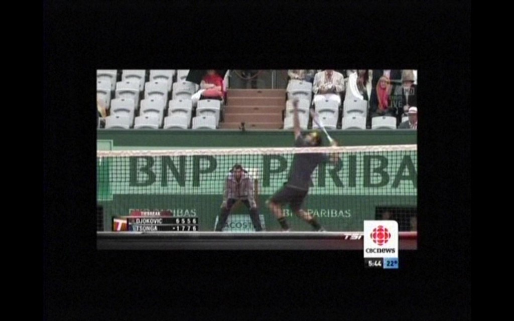
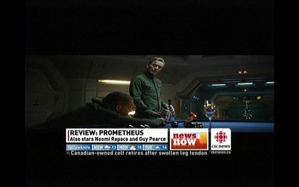
The fun never ends. Here are a few recent screen captures from CBC Newsworld, illustrating how originally widescreen material is letterboxed to a standard definition frame, which is then letterboxed into a widescreen frame, which is then letterboxed into a standard definition frame, which then appears on a widescreen monitor… welcome to the era of postage stamp television images. My favorite is the second one, the screen shot from Prometheus… for some inexplicable reason, they actually further compressed vertically (or stretched horizontally?) an already widescreen image.
Of course marketers knew what they were doing. They knew that most people cannot tell the difference between a resolution of, say, 640×480 vs. 1024×768. So they changed the aspect ratio. And of course they aren’t describing the result as being reduced in height, stunted perhaps; they tell you that it is wider. Wider is good, right?


