For years, I’ve been using the online TV guide provided by ZAP2IT to check what’s on TV. Generally speaking, I’ve been satisfied with their service.
Until last year, when they introduced a whole new layout. Which, in my considered opinion, was a significant downgrade (makes me wonder if they were perhaps inspired by Windows 8).
Today I noticed, to my considerable pleasure, that the old layout is back. I now have the option to “Switch to Classic View”. Which I promptly did, without hesitation and with no plans to change my mind.
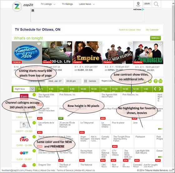
Now I am no usability or ergonomics expert, but I do have 30-odd years of experience in IT, and I know a thing or two about user interface design. Here are two illustrations that show why, in my considered opinion, the old format is far superior to the new one. First, the new version, with some of its shortcomings highlighted:

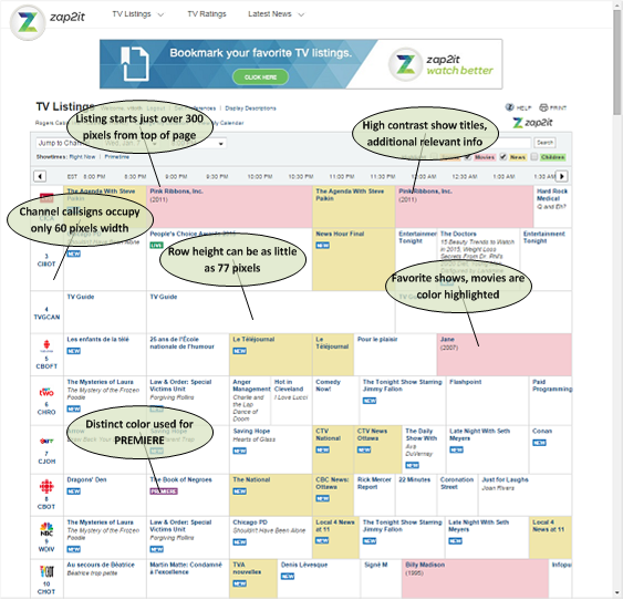
And now here are the same shows, in the old format:

So much easier to view! So much easier to find things of interest!
When they switched to the new format, I wrote an e-mail to complain. I did not expect a meaningful response. Noticing the link today, inviting me to switch back to the old format, was a most pleasant New Year’s surprise. I wrote to them again, thanking them for making the old format available. I hope it stays that way.
I know, I know, let this be the biggest problem in my life, when people are suffering and dying in various corners of the world. For what it’s worth, I never for one moment forget how lucky I am to be able to enjoy the luxury of life in a country like Canada. But this stupid TV guide still bugged me :-)