Would you like me to scare you into offering me some Halloween candy?
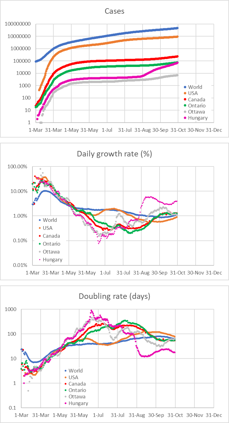
Here are some plots from the spreadsheet that I’ve been using to keep track of COVID-19 numbers since the spring.

I am tracking global figures, numbers in the US, Canada, the province of Ontario and my city Ottawa, as well as the country of my birth (and where our elderly parents live), Hungary.
The number of cases needs no explanation. The trends are not good. Hungary, in particular, appears to be a representative case of Europe in general, where the numbers began skyrocketing in recent weeks, per capita figures far exceeding those in Trump’s America. (So perhaps it’s not politics, after all.)
The daily growth rates are also alarming. The only place with a downward trend is Ottawa. Everywhere else, the growth rate is increasing. A constant growth rate in this chart would correspond to an exponential rise in the total number of cases; an increasing growth rate implies super-exponential behavior.
This is also reflected in the doubling rate. In this chart, the higher the number, the better; a high number of days means that the spread is slow. Again, with the exception of Ottawa, the numbers are trending downward (which is bad), or at best, are perhaps stagnating (in Canada and Ontario). And look at Hungary again! According to the latest data, the number of cases there doubles every 16-17 days or so, which is frightening.
These charts show seven-day averages. Again, the usual disclaimers apply. Country-to-country comparisons need to be made with care, due to differences in testing and reporting regimes. But the trends are another matter.