Feb 152009
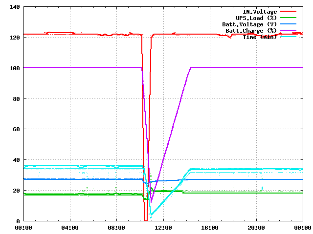
Here’s a nice plot of yesterday’s power outage, courtesy of my server:

Power on Feb 14, 2009
Interesting how the capacity drop and the recharge curve are both perfectly linear. Makes me wonder how accurate these curves are… do they really represent measured values or just a simplistic guess by software?
On the other hand, both UPSs ran fine for over half an hour, one supplying a server and networking equipment, another supplying a workstation, monitor, and some peripherals. So I really have no cause to complain.