Here’s an article worthy of a bookmark:
http://peltiertech.com/Excel/Charts/XYAreaChart2.html
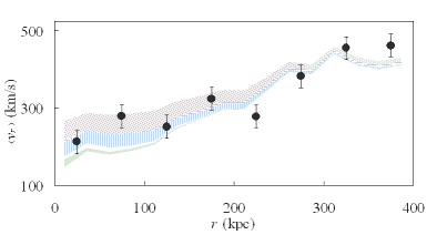
It offers a way to produce a chart in Microsoft Excel much like this one:

Filled XY area chart
This chart is from something I’m working on, an attempt to test gravitational theories against galaxy survey data.
The link above also comes with a warning: the discussed technique doesn’t work with Excel 2007, due to a (presumably unintentional) change in Excel’s handling of certain complex charts. A pity, but it is also a good example why I am trying to maintain my immunity against chronic upgrade-itis. Two decades ago upgrades were important because they fixed severe bugs and offered serious usability improvements. But today? Why on Earth would I want to upgrade to Office 2007 when Office 2003 does everything I need and more, just so that I can re-learn its user interface? Or make Microsoft richer?