The other day, Elon Musk’s Grok kindly drew a plot for me. After it estimated (understandably crudely, since the data are inconsistent/unreliable) the percentage of global wealth owned by the top 1%, I asked it to create an diagram for inclusion in Web pages. Well, here it is, though converted to a PNG for easier sharing:
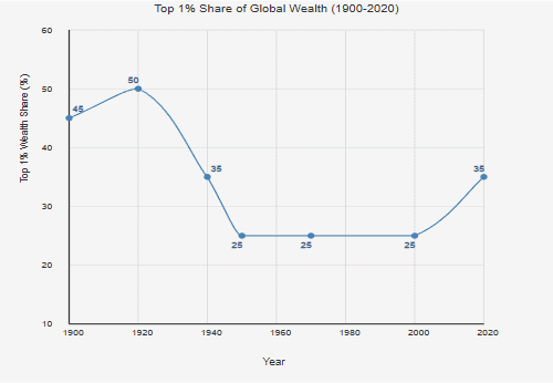
What is the significance, you might wonder? Simple. Look at the beginning, the early 20th century. Rising inequality, resulting in well-known upheavals: a world war, revolutions everywhere, the rise of totalitarianism, another world war.
But then, inequality plummeted. Not only that, it stayed low for decades. Precisely the decades of Pax Americana, the peaceful world of the Cold War, a world with two superpowers, yet a world that was mostly defined by the rules-based, liberal democratic world order imposed by the United States of America.
It all began to unravel in the late 1990s. Since then, inequality has been rising at a rate probably faster than the rate that characterized America’s Gilded Age in the late 19th century.
We know what happened the last time the world went down that road.