Here is a map I just created using R, utilizing an OECD housing prices data set. Specifically, the price-to-income ratio, which is to say, how (un)affordable housing can be in various leading economies.
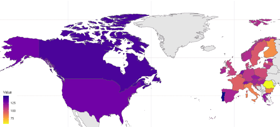
Why do I find this map scary? Well, the value of “100” represents the OECD average back in 2015. That was high enough already. Things have become a lot worse since.
Here in Canada, housing is now 38% more unaffordable than it was nine years ago. Canada is near the top of this list; only Portugal is worse (49%). The United States is not far behind, at 29.3%. And it’s not like housing was terribly affordable in any of these places back in 2015 either.
To be sure, there are a few countries where housing has become somewhat more affordable: Finland, France, Romania, Sweden are a few examples. One has to wonder though about the reasons. Is it the closeness of Russia, as in the cases of Finland or Romania? Is it a failed immigration policy, as in Sweden? Or perhaps political uncertainty, as in France?
In any case, in the majority of OECD countries both in North America and Europe (shown in my map) and elsewhere, the situation is a lot less tenable now than a decade ago, and things are not about to change direction.
When something as basic as housing becomes out of reach for many, we know we have a problem. In case anyone is wondering why populism is gaining traction everywhere, here’s the answer.