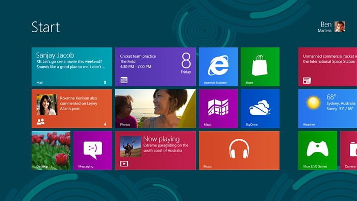
Remember Microsoft Bob? The revolutionary new interface for Windows that was supposed to make everyday computing easier for the unwashed masses?
It was one of Microsoft’s most spectacular product failures, surpassing even the dreadful Clippy (which, after all, was just an unwelcome feature in an otherwise successful product, Office 97).
But now, it seems that Microsoft is determined to do it again. At a time when the operating system is becoming increasingly less relevant to most users (who cares what operating system runs underneath your browser when you access Gmail or Office 365?) they seem to be dead set on alienating that one class of users for whom the operating system still matters: content creators, which includes artists, designers, software developers and the like.

To their credit, Microsoft is doing this in the open, documenting in a very lengthy blog post the basic ideas behind their most controversial design choices.
But the comments are revealing. Here is a random selection (certainly not unbiased) that I found that I could most closely relate to. After all, just like one of the commenters, I, too, “tried Windows 8 for 2 weeks and then uninstalled“… or rather, not so much uninstalled as never looked at the VM again in which it was installed because I just couldn’t care.
So here are those comments:
“Can someone help me out? Should I install Ubuntu, get a Mac, or keep using Windows 7?”
“Your product is named after a feature of your product. And now the new version of your product tries to abandon said feature in its newly introduced usage mode.”
“Google just added windows to Chrome OS. You are removing windows from Windows. This won’t end well.”
“Except for immersive games, I DON’T WANT to run a single full-screen app. Not ever. If I want something to fill the screen, I will maximize the windows.”
“There is a significant disjunction in the UI. when you hit the start button and are whisked into metro land just to search for something, only to come back to the desktop”
“Thank you Microsoft for this complete failure. I for one welcome our new KDE overlords!”
“None of this TABLET CRAP belongs on desktops!”
“The cold, hard truth of the matter is that Microsoft have created an operating system that I feel is OPENLY ANTAGONISTIC to power users, business users, creative professionals and anyone seeking to use their PC as a productivity tool.”
“In WW2 the English started a program to analyze aircraft to figure out where they needed to add armor. They looked at all of the planes coming back and did frequency analysis of where the bullet holes were. Some areas were so riddled that easily 60% of bullet holes hit these key areas. The first reaction is to armor these heavily hit areas of the plane. This is wrong. These planes survived. The armor should go everywhere else.”
“You are killing Aero? You have to be kidding!”
“Windows 8 prognosis for sales: not that good. That is the latest finding from research entity Gartner.”
“I have to give you credit Microsoft, you really do know how to alienate people.”
“The flat UI in no way looks premium. It is harsh, spartan, and an eyesore.”
“The Metro environment severely compromises functionality by:
- not allowing real multitasking (only applications in the foreground are allowed to use CPU);
- not allowing more than two applications to run in the foreground (all other applications are suspended).
- not allowing the two apps in foreground to use half the screen each (most of the time one of the two apps will be unusable because it has too little space to display information).
- not allowing the use of more than one display for Metro apps.
- not allowing more than one running instance for an Metro app.“
“And the most scary thing is that we already have an example of crippling the Desktop: Windows on ARM/Windows RT. By not allowing third party Desktop applications, the Desktop is only there to allow you to use MS Office.”
“Do you have a logical explanation why you are screaming permanently that these 9.1 percent iPad/iPhone/Android users are more important than 90% desktop users?”
“Pls provide a METRO ON/OFF option in Windows 8 (only desktop). With Mouse&Keyboard, METRO is bizarre to use.”
“How does Windows 8 “metro” and other this teletubby nonsense work on multimonitor setup?”
“It’s a degradation of Windows. New UI is terrible”
“The metro interface is horrible and whoever designed it should go back to work for whatever cell phone company they crawled out of. Lets stop dumbing down the computer for the appliance user.”
“From my perspective, Aero glass is still fresh and new. The loss is ultimately cosmetic and therefore minor, but it adds to one of the bigger issues with Windows 8’s UI”
“Using Windows 8 with a mouse is about as much fun as running Windows Phone 7 in an emulator all day.”
And finally, the last comment that sums up my own feelings neatly:
“If W8 really works on a desktop used by adults I’ll consider it”
But not until then.


